Beyond the Arc
SUMMER 2023
BRIEF
Beyond the Arc is a podcast that prides itself on its in-depth analysis about the world of basketball. Due to its rising popularity, the creators of the podcast hired me to redesign their logo in order to add professionalism and relevancy to their brand.
BRAINSTORM
I met with Matt, one of the creators of Beyond the Arc, to understand more about the heart behind the brand. Throughout the conversation, I highlighted some key words that would be essential for the logo to incorporate and communicate.
MOODBOARD
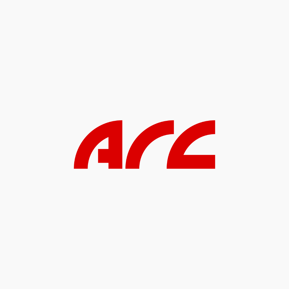
Due to the length of the podcast name, I knew the logo had to either be a monogram or a symbol. While collecting inspiration, I noticed that I was drawn to logos that played with shapes to form the letters of the brand initials.


DESIGN ROUND 1
DESIGN ROUND 2
DESIGN ROUND 3
FINAL DESIGN ROUND
To make the letters more legible, I thickened the width of the lines and gaps between shapes. In terms of color, I decided to go with a black and orange color palette, as orange draws attention and black exudes a sense of authority.
RESULTS
After my client published the redesigned logo on all of their streaming platforms, Beyond the Arc added 100 new followers and experienced an increase of 10-15 consistent listeners.