Spark Foundation
FALL 2024
BRIEF
The Spark Foundation is a fictional organization inspired by the Make-A-Wish Foundation, dedicated to granting the wishes of children battling critical illnesses. For children diagnosed with chronic illnesses who may not qualify for a wish, the Spark Foundation collaborates with local hospitals to organize bi-monthly programs and activities, providing these children and their families with continual opportunities to create positive, lasting memories.
RESEARCH
The primary audience for a wish-granting organization like the Spark Foundation is parents. While they cannot change their child’s diagnosis, they will seek out any program or service that can alleviate their child's suffering and bring them moments of joy. The brand identity of the Spark Foundation is crafted to be both fun and vibrant, while maintaining a sense of professionalism to establish trust and credibility with parents.
BRAND MISSION + STRATEGY
LOGOMARK
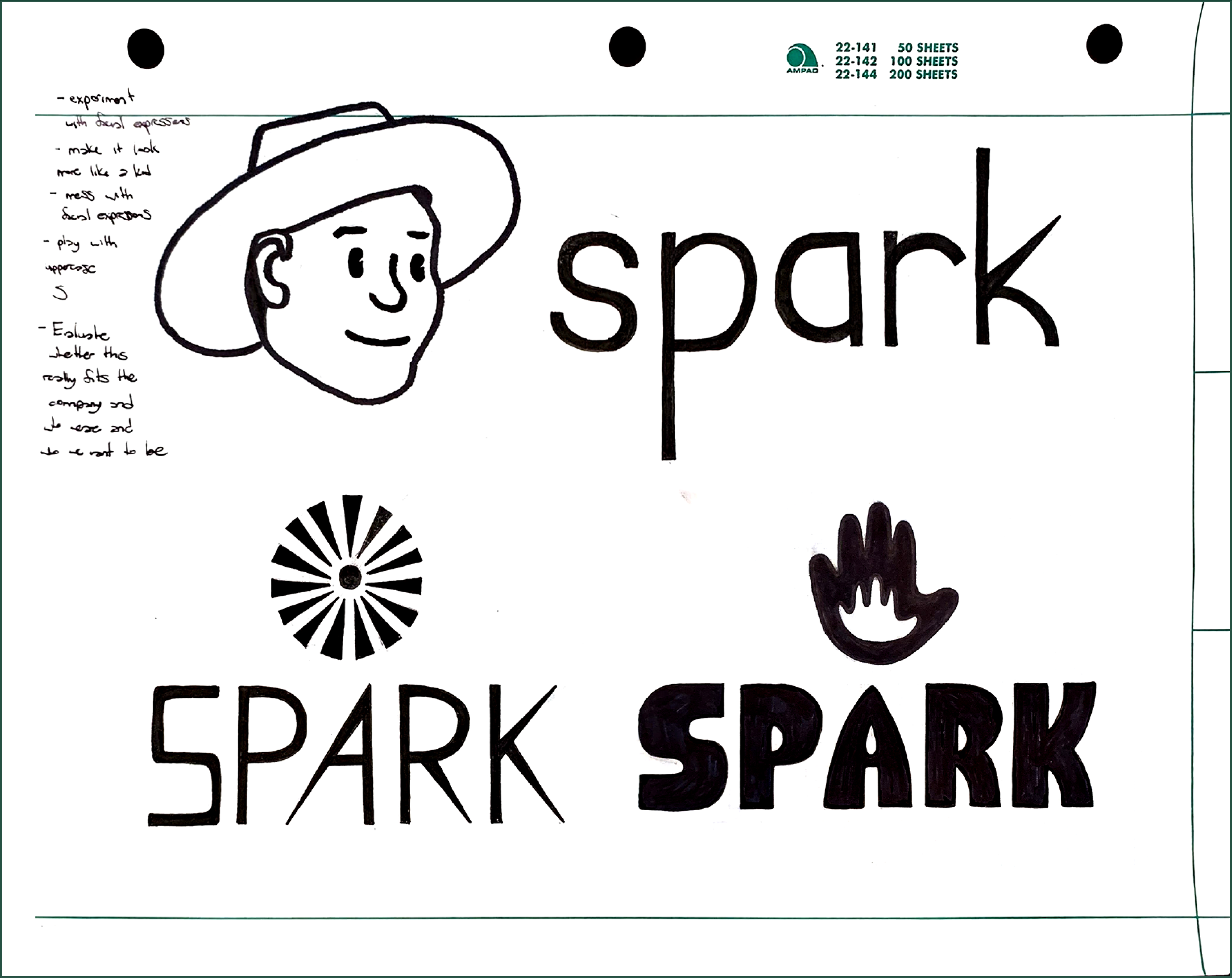
Every element of the primary mark has been thoughtfully designed to reflect and reinforce the core values of the Spark Foundation. The lowercase letters in the wordmark convey a sense of warmth and approachability, while the subtle rounding of the edges adds a level of professionalism and credibility. The tall x-height ensures the mark is legible and easily recognizable, even from a distance—an essential feature in hospital settings. The symbol is composed of 15 rays, each representing a child between the ages of 3 and 18 that the organization serves. Each ray directs toward the central circle, embodying the foundation’s child-centered approach. Additionally, the six rays in the grape hue symbolize the six continents the foundation serves through its international branches.
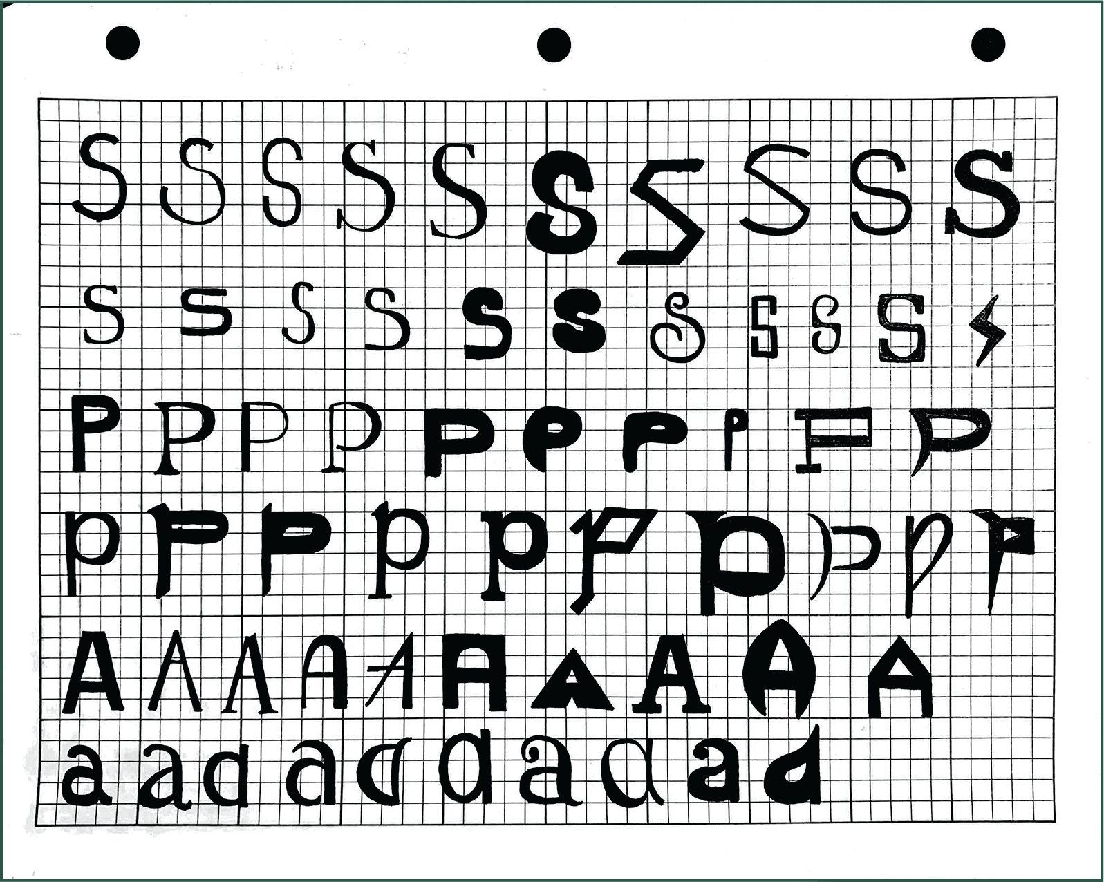
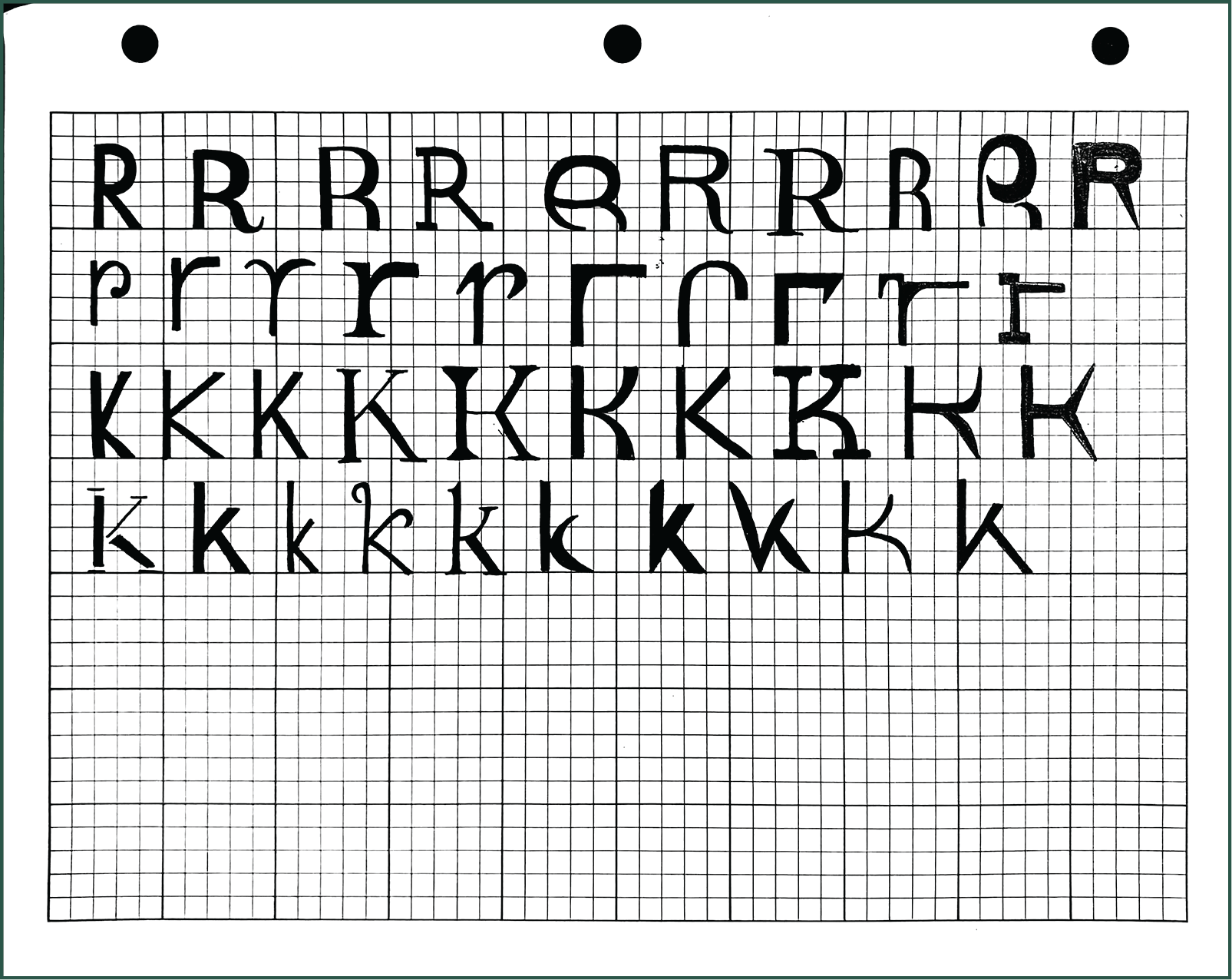
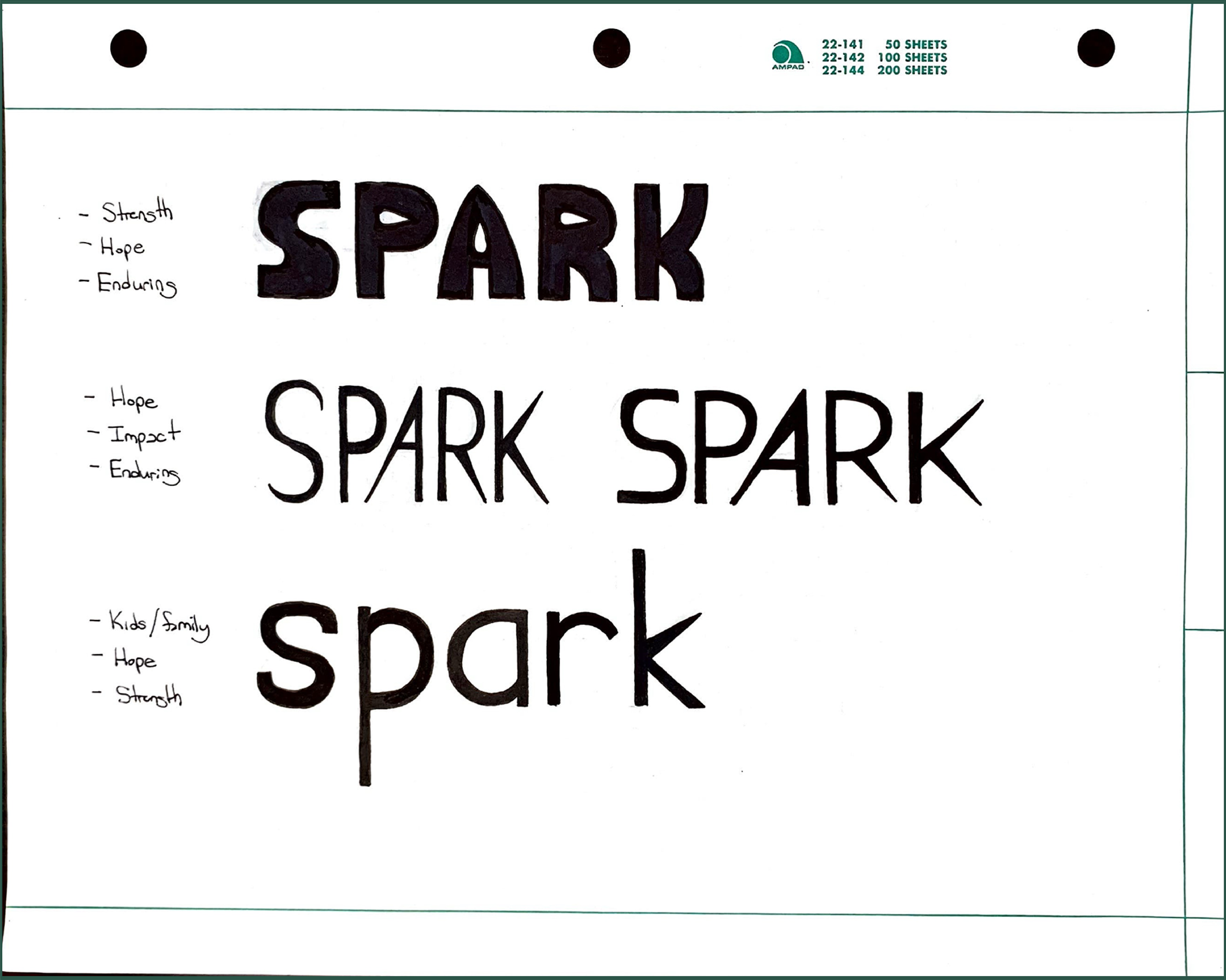
Sketches + Process
BRAND GUIDELINES
In addition to creating an original brand identity system, I developed a comprehensive brand standards manual, outlining guidelines for the proper use of colors, graphic elements, typography, and more.
COLOR PALETTE
The primary color palette consists of grape, magenta, sky, and lime—chosen for their brightness, vibrancy, and energizing qualities. These colors were selected to infuse energy and life into the Spark Foundation’s designs, particularly in hospital environments. Since many of the foundation's designs are displayed within hospitals, the colors are meant to uplift the children and families who call these spaces their temporary home.
TYPEFACE
New Hero is the primary typeface for the Spark Foundation’s brand identity, chosen for its exceptional legibility and friendly character. With a tall x-height and spacious counters, New Hero stands out as the ideal choice to embody the Foundation's design strategy, ensuring that communication remains clear and approachable while maintaining a sense of warmth.
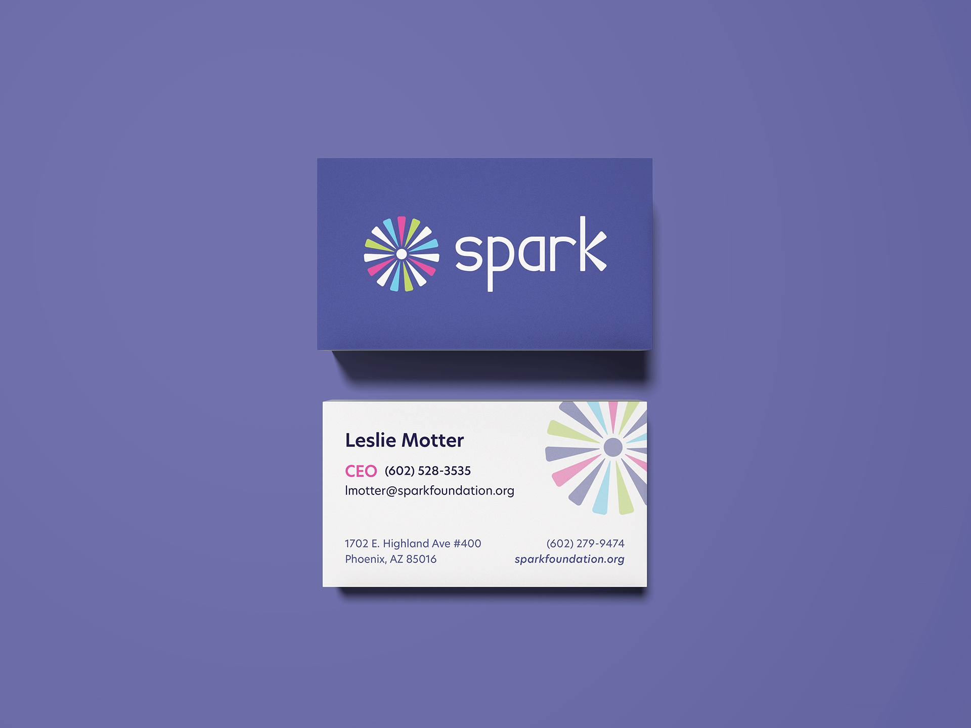
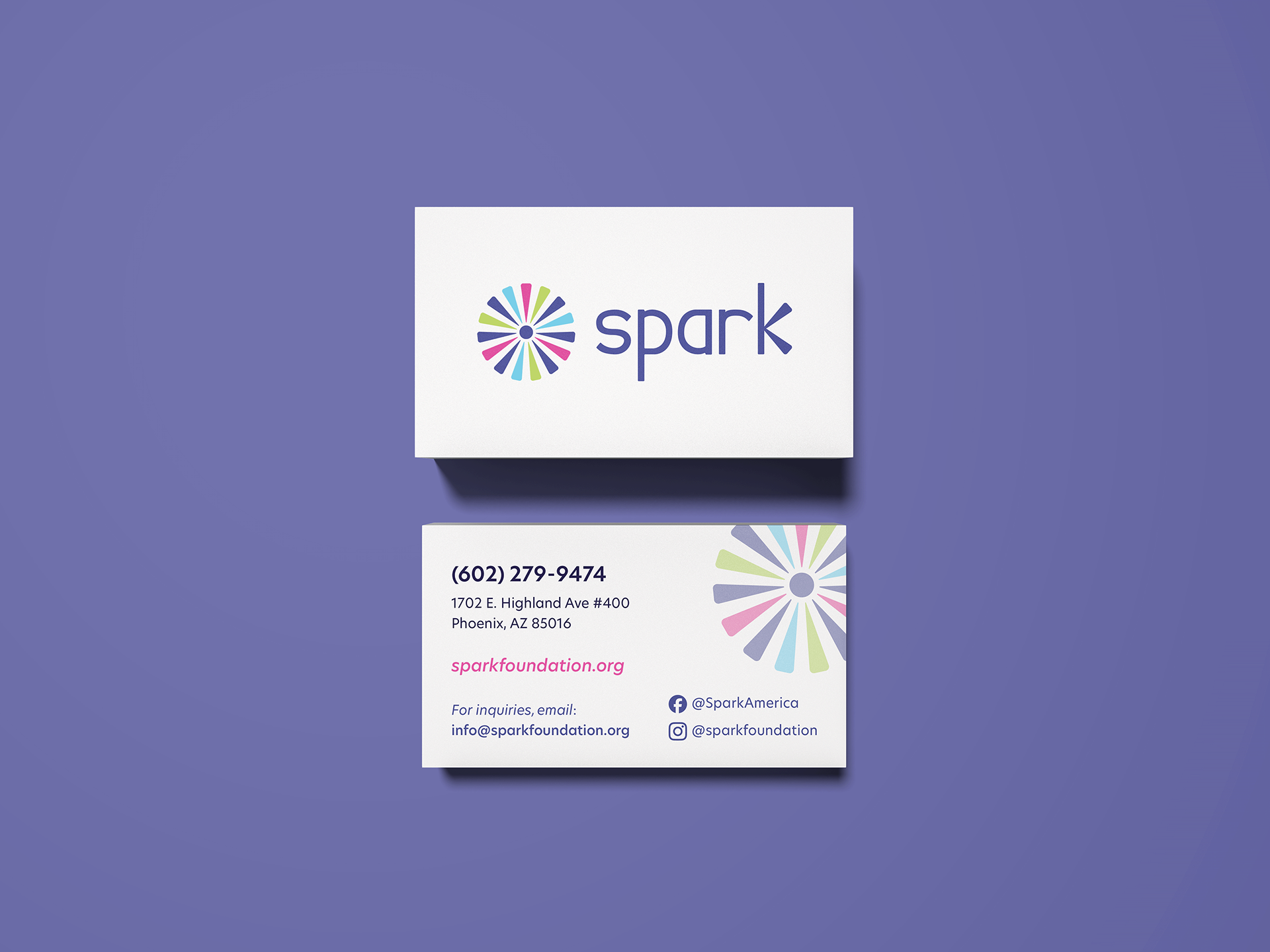
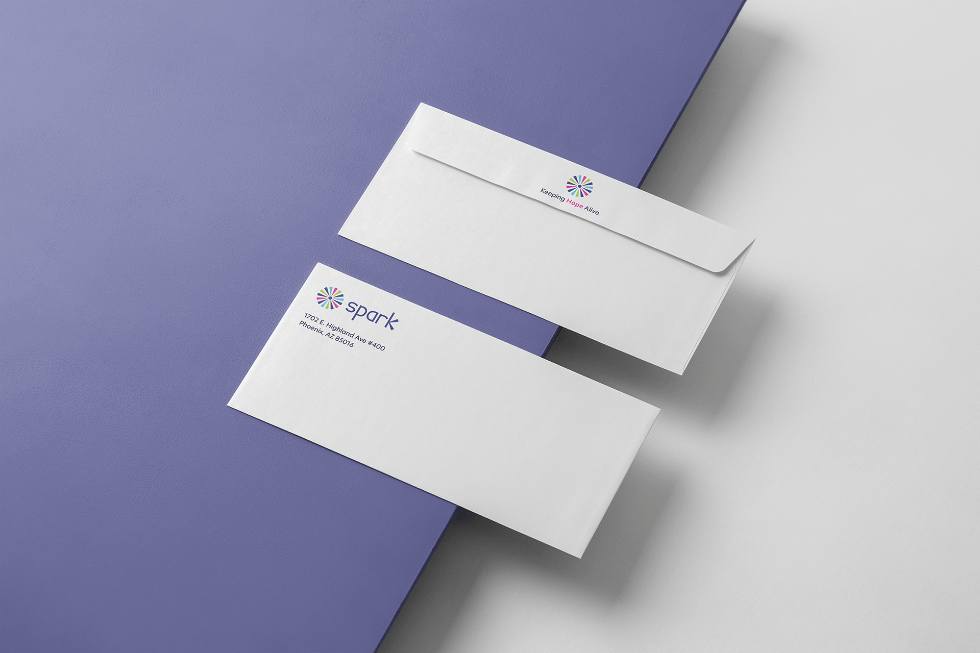
BUSINESS SYSTEM ITEMS
PRINT APPLICATIONS
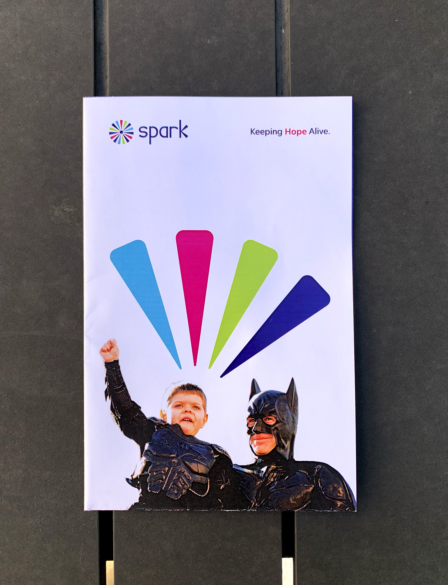
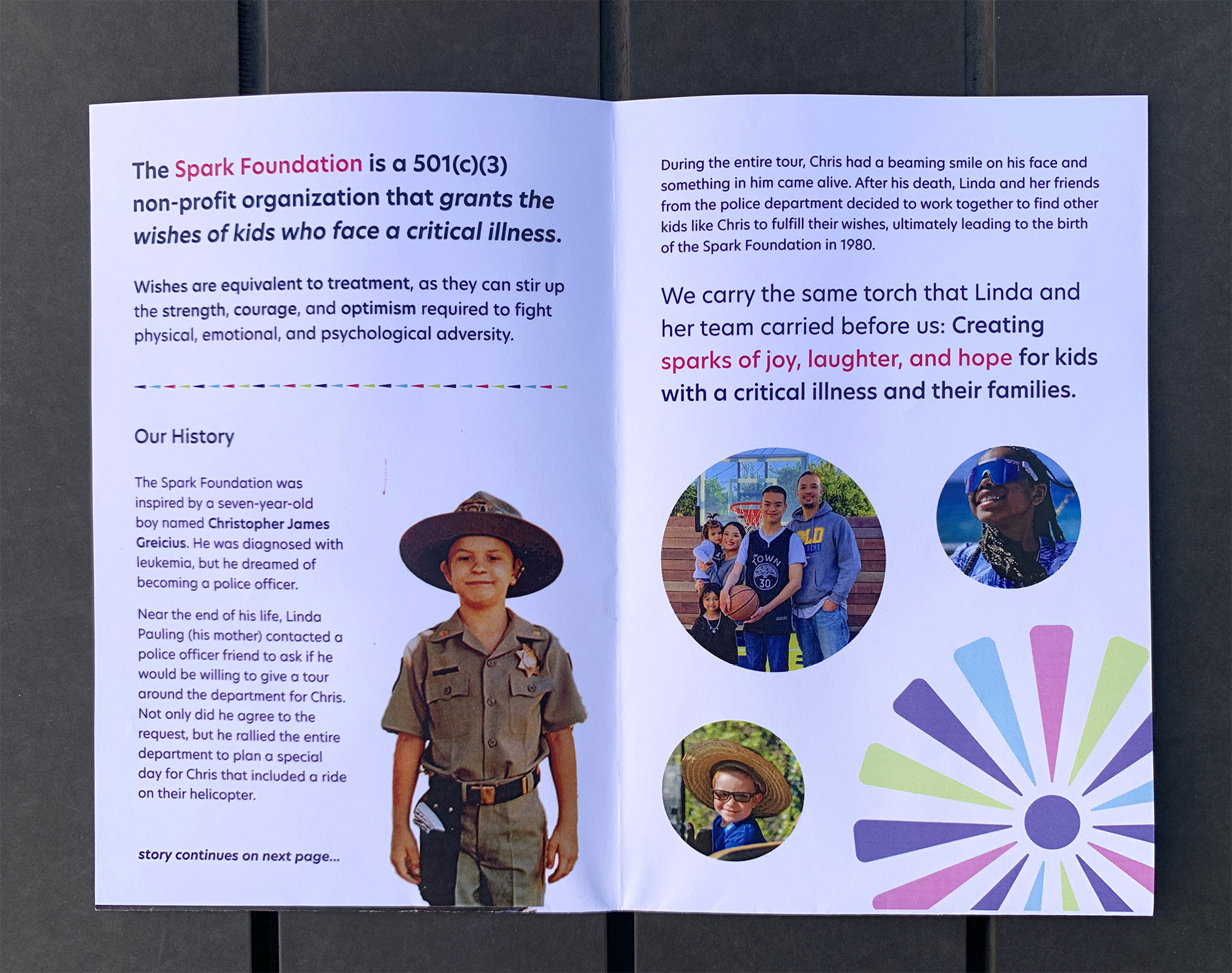
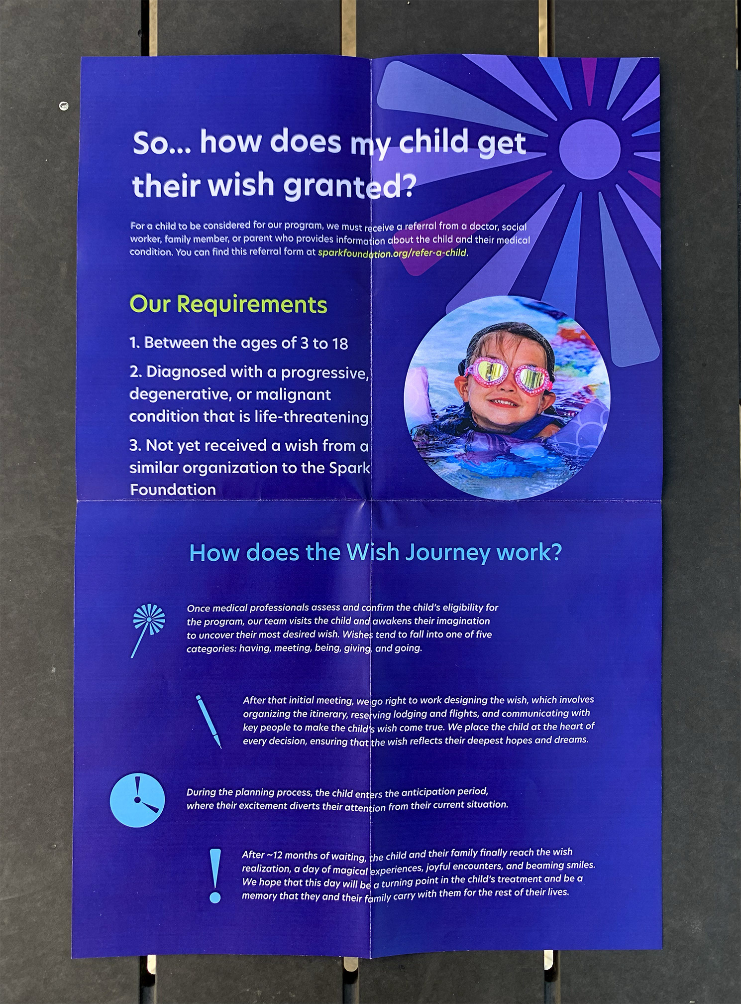
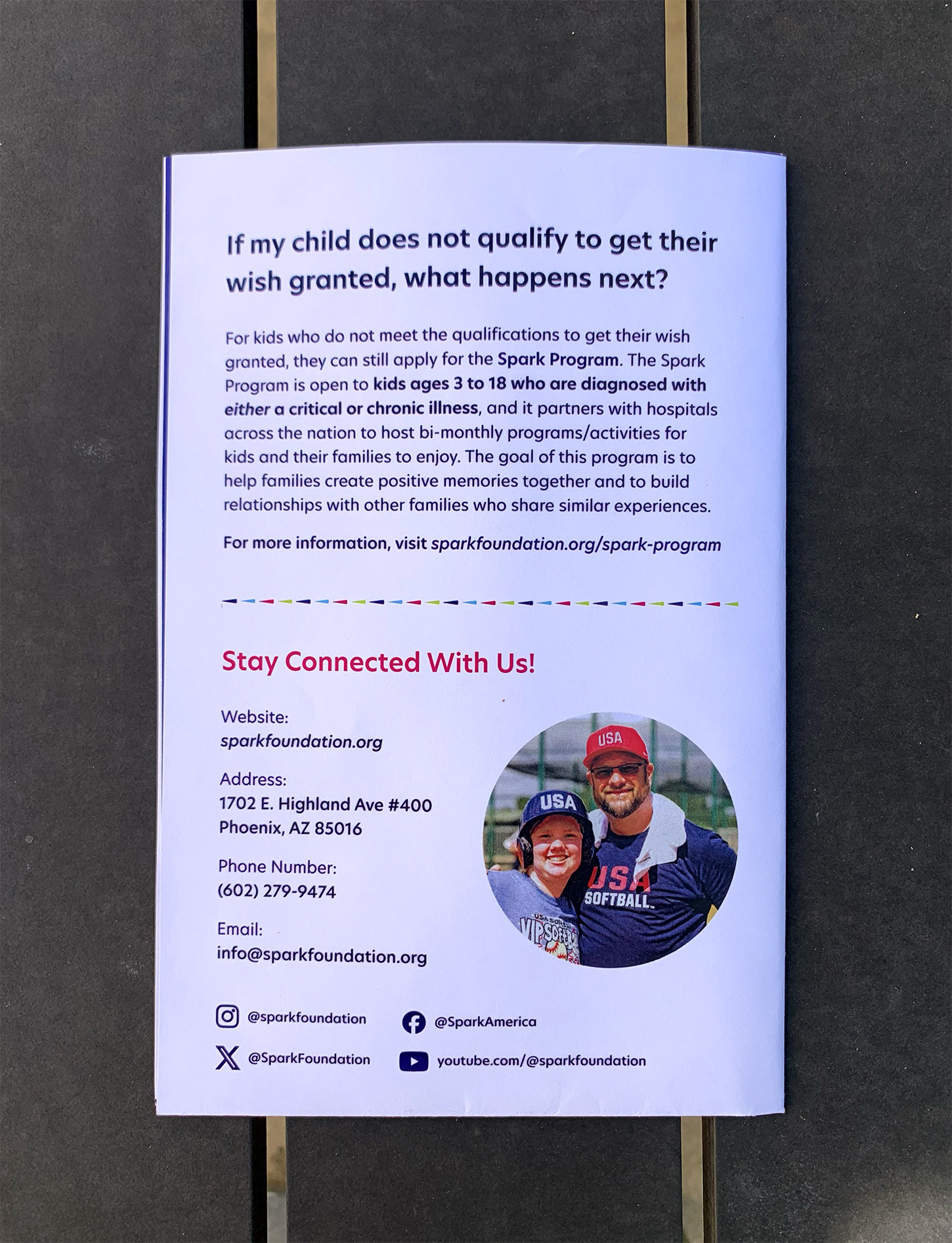
Infographic
Poster Series
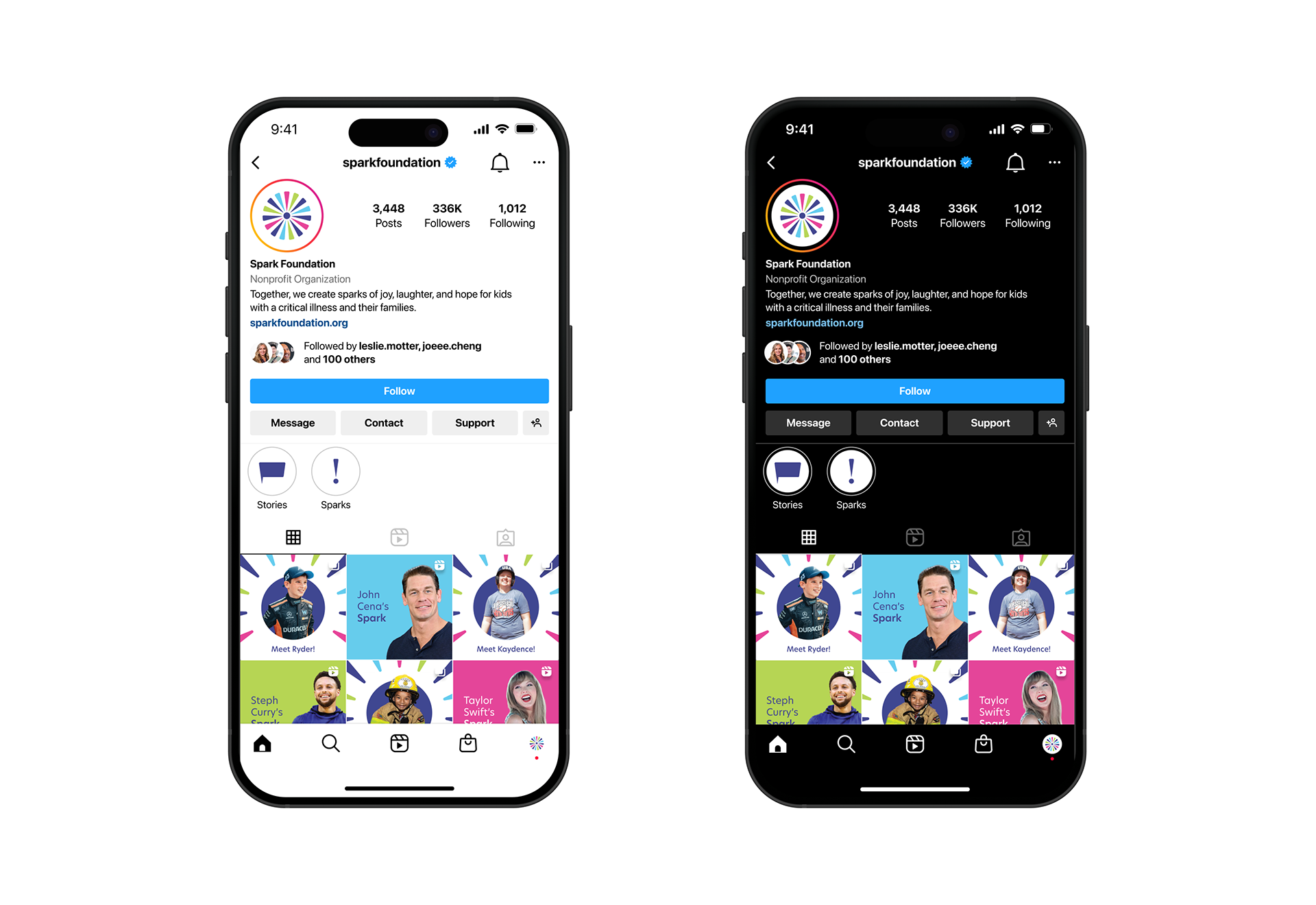
DIGITAL APPLICATIONS
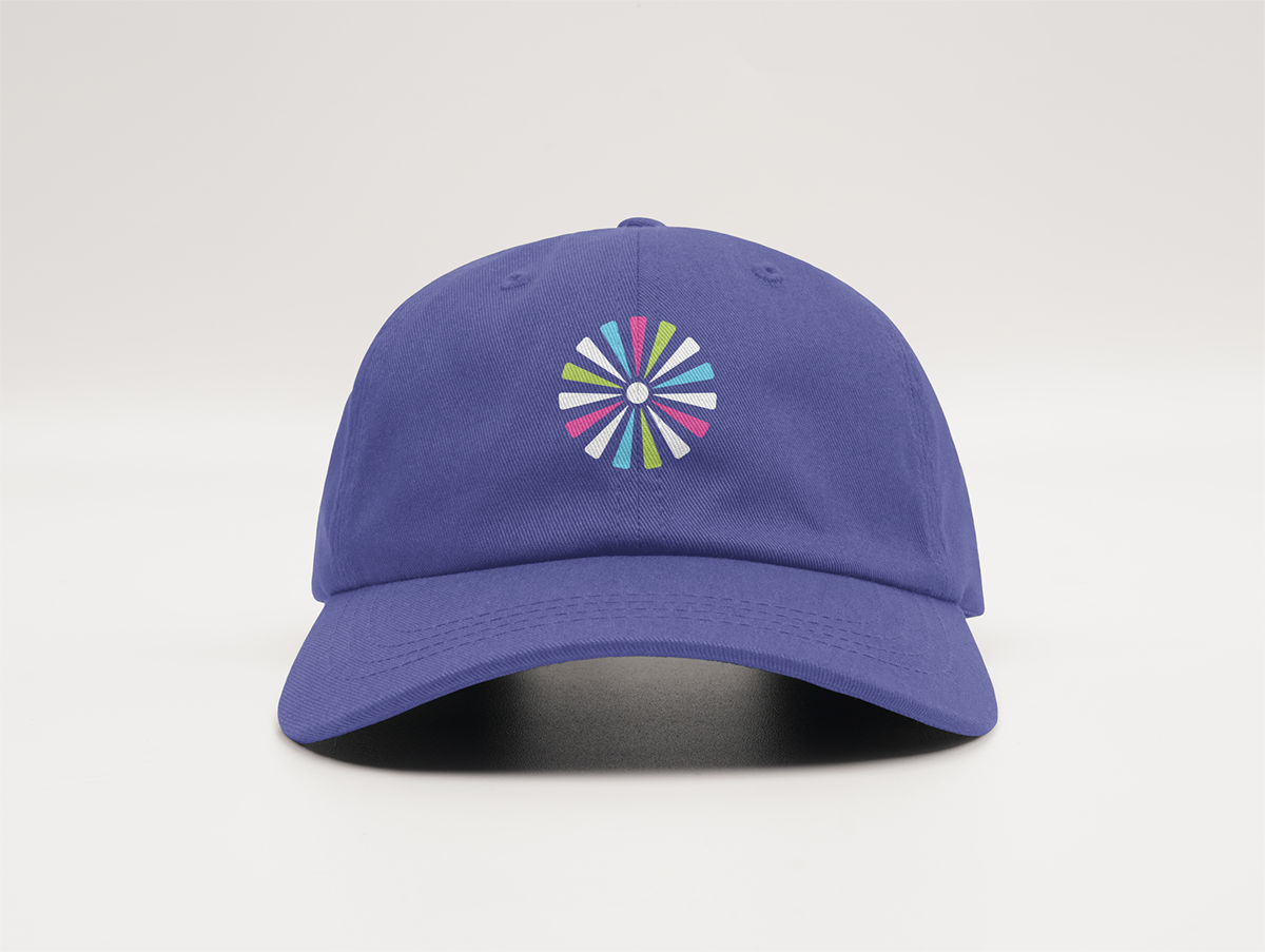
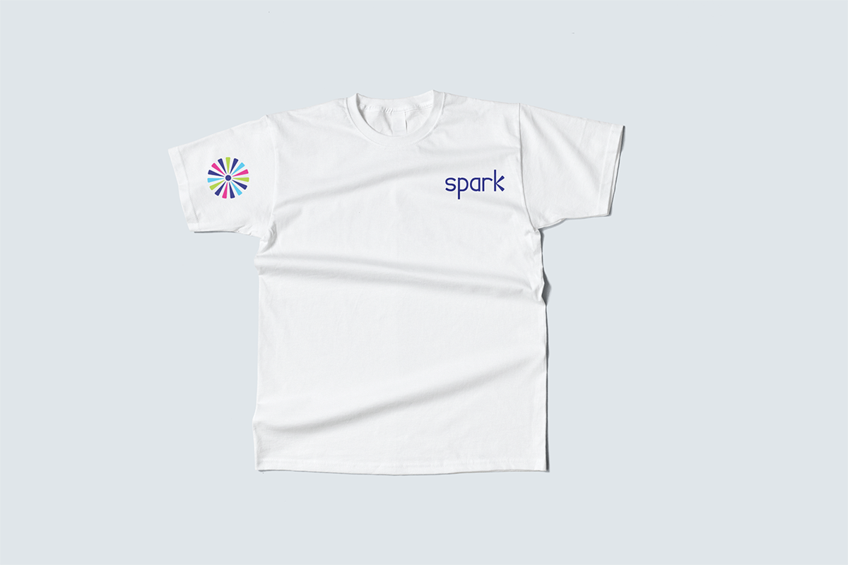
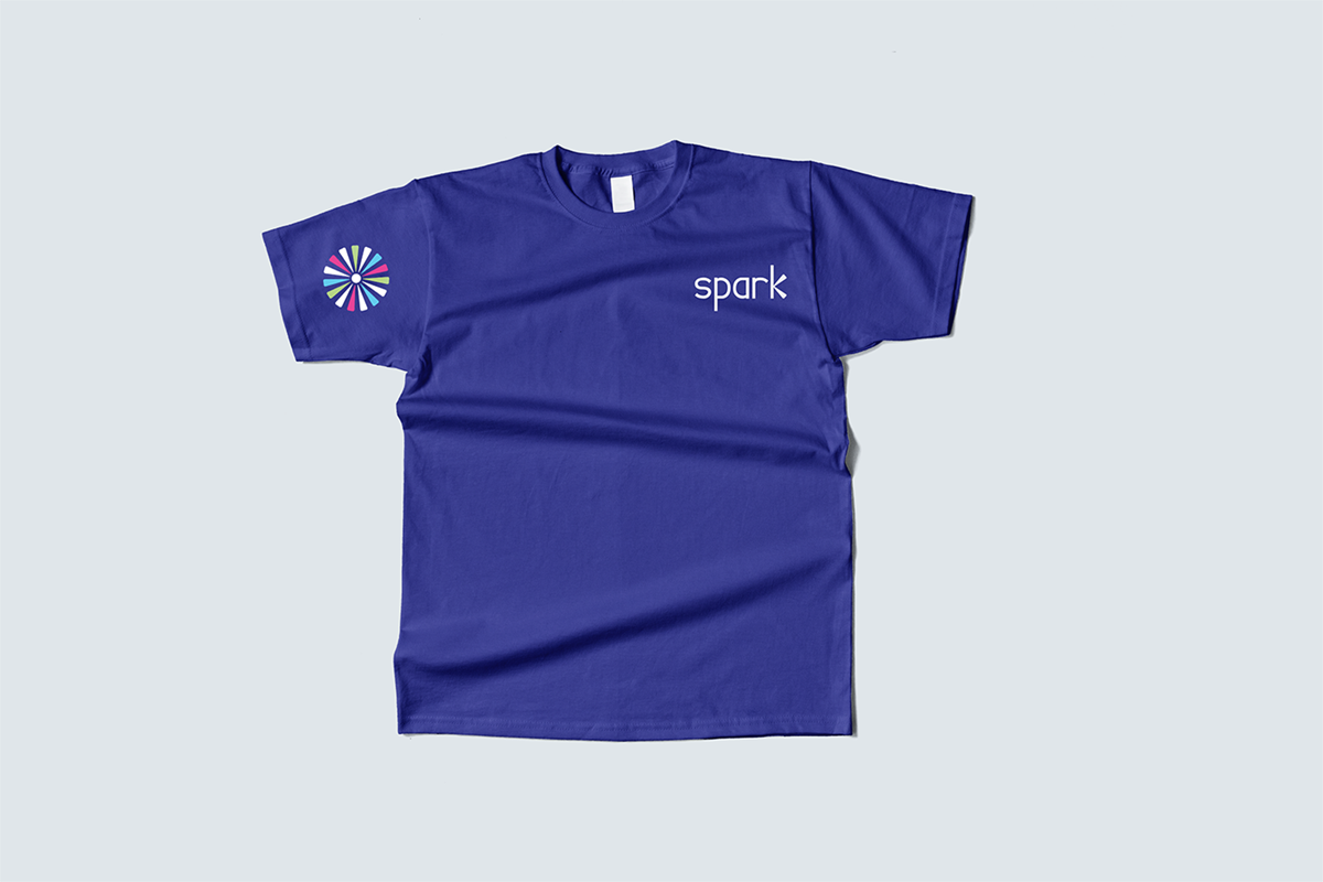
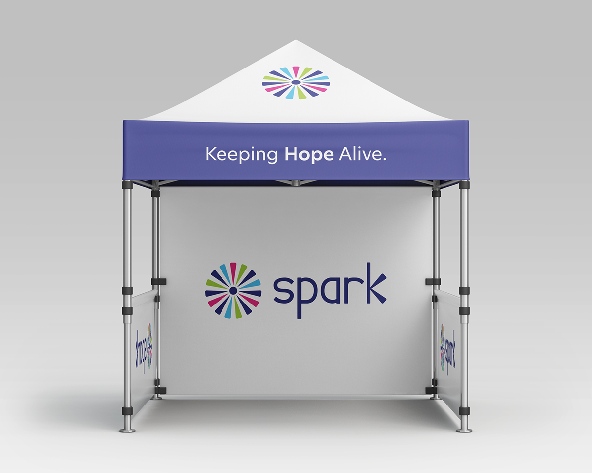
MERCH
